Embracing the Art of Print Design. In my 25-year journey as a designer, I’ve seen design evolve, but one thing remains certain: print design is far from fading. Let’s dive into why print design not only stands strong but continues to captivate in our digital era.
Th…
Are You Losing Business Because your Website Isn’t Ready for Voice-Search?
Ok Google, Alexa (Echo), Siri, Cortana – the ability to search the web without looking at or touching a screen is growing. I don’t know about you but I know I have rolled my eyes when I ask a question and either don’t get a voice response or get, “Here are some …
Up Your Email Marketing Game
Staying in front of past, current and potential clients is important. And sending useful, interesting or entertaining emails is a good way to do it.
It surprised me to learn that a Marketing Sherpa study found that 91% of adults in the US like receiving promotional ema…
How to Optimize Local SEO
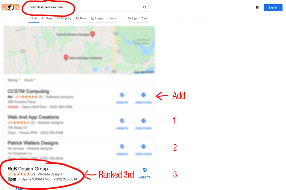
If you are like me, you do local searches all the time. To find the phone number for that little shop you like. To find a nearby coffee shop. To find a plumber, florist, tree service, home decorator, dentist … the list is endless.
Blogging Isn’t Enough
You likely know that you need to have a blog on your website. It lets the search engine crawlers know that your site is active, it gives you a place to use keywords to help you be found when your potential clients do a search and it creates a way to stay in touch with e…
How to Tell Your Customers You’re Open
Whether you agree with the loosening of restrictions or not, they are coming. But – there are social distancing and sanitation rules. You are ready, willing and able to comply with the government regulations. Perfect.
8 Red Flags It’s Time to Update Your Website
Some people treat their website like it’s something you do once and it’s good for a lifetime. Others know they need to update it but life happens and their website gets pushed to the back burner – for years.
A Free Website Might Disappoint You
Whether you are just starting out in business or having to cut expenses to the core to survive in the Covid-world, a free website can sound intriguing…
WordPress Pricing: How Much Does a WordPress Website Really Cost?
Despite being advertised as a free platform, WordPress pricing isn’t quite that simple. Sure, you can set up a free account on WordPress.com, however, the site comes with limitations that many users will likely outgrow. Then there’s the famous, free, open source,...


